Company
Sports Interactive | SEGA
My role
UX UI Designer
Year
2020 - 2021
Overview
Adding new and improved features to the world's top football management simulation game developed by Sports Interactive, published by SEGA.
Problem statement
In today's fiercely competitive mobile gaming landscape, sustaining user engagement and delivering an immersive experience are imperative for success. Football Manager Mobile confronts the ongoing challenge of meeting evolving player expectations while preserving its core gameplay essence.
The 2020 iteration of the game fell short of maximising user satisfaction and extending gameplay sessions due to lacking features and optimisations. Integrating player dynamics, a robust tactics platform, refined set pieces, enhanced player interaction sections, nuanced player squad relationships, and a refreshed iconography throughout the game promised to invigorate user experience and drive prolonged engagement.
Goals
Bring 'Squad dynamics' from the PC version into the mobile version but simplified somewhat for the mobile audience. The mobile version comprised of one specific section of ‘Club Squad’ with several different areas within it:
A / Hierarchy
B / Social Groups
C / Player Squad Relationships Page
Update all assets to reflect new game branding for 2021 iteration
Refresh and rationalise all game icons, refresh on-pitch game assets.
To break the previous years' sales records, demonstrating the game's continued relevance and appeal while solidifying its position as the premier football management experience on mobile platforms. Our ultimate objective was to establish Football Manager Mobile as the definitive destination for football enthusiasts, offering unparalleled depth, realism, and enjoyment on mobile devices.

Process
Research & discovery
Stakeholders Interviews
I conducted interviews with key stakeholders to understand business objectives and project requirements.
Secondary research
I leveraged secondary research to gather valuable insights and support my discovery. By examining the existing PC game, I strengthened the foundation of my work, providing a well-rounded perspective on the topic at hand.
Deliverables
A / 'Hierarchy' section
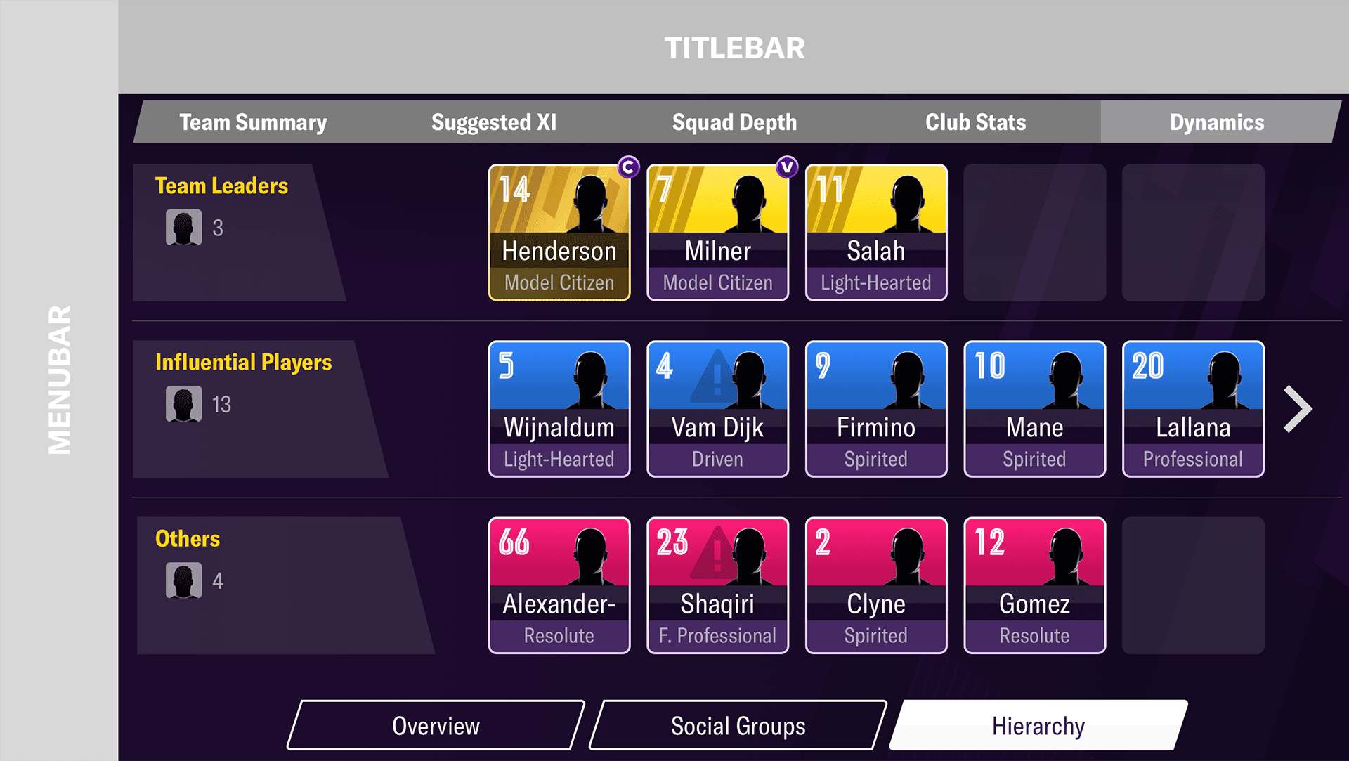
Taking the PC version as a starting point, my brief was to display the hierarchy of players within the club so users can at a glance see which are the most important. Screen size limitations was an issue on mobile, so these had to be taken into consideration. The design needed to show the most influential players (both negative and positive).
The groups to be shown were:
Team Leaders
Highly Influential Players
Influential Players
Others
A new smaller version of the player card would need to be designed for this feature. The new card would be clickable and take the user to the ‘Squad Relationships’ section of the player profile.
Early sketches

Wireframes in Miro

Pyramid hierarchy
The proposal of showing the different layers stacked like a pyramid resonated well with the stakeholders. The only foreseeable usability issue was with the size of the card, would the contents be too small? Removing a row would allow for the cards to be bigger.
1st iteration
Increasing fidelity
Further iterations led to a higher resolution of wireframe. Removing a row did allow for the cards to be increased in size. I added arrows to allow the user to scroll and view more players.
Hierarchy iterations
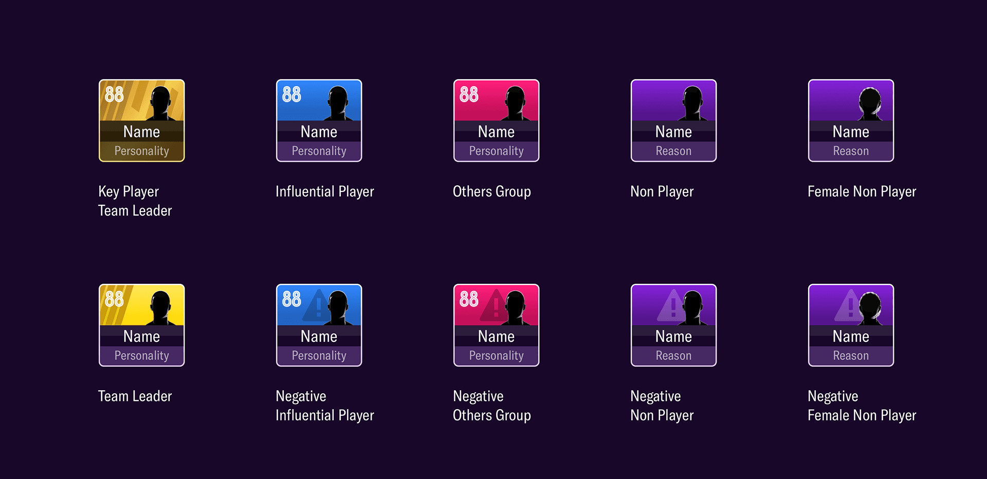
A new card component was required. The card needed to contain, an avatar or an image of the player, player name and number, as well as their influence. I also introduced a notion of a light source and from above direction into the assets. Hopefully giving the UI a richness. I would take the lighting concepts onto other UI used within the game.
For the 'Team Leaders' I wanted them to have distinctive look and separate from the others. I introduced an extra level of detail to add a certain refinement.
Final small player cards
Getting ready for hand off
Adding onto the cards small icons to represent the captain and vice captain. The high fidelity screen for sign off and handover for development.
It was decided to drop the subtle pyramid from the released version in the end.
High resolution visual
Final in game screen

B / 'Social Group' section
Football Manager PC social group
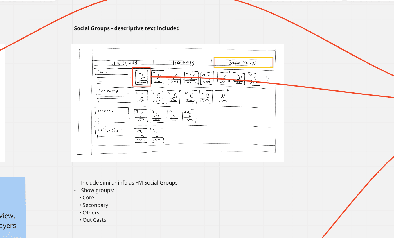
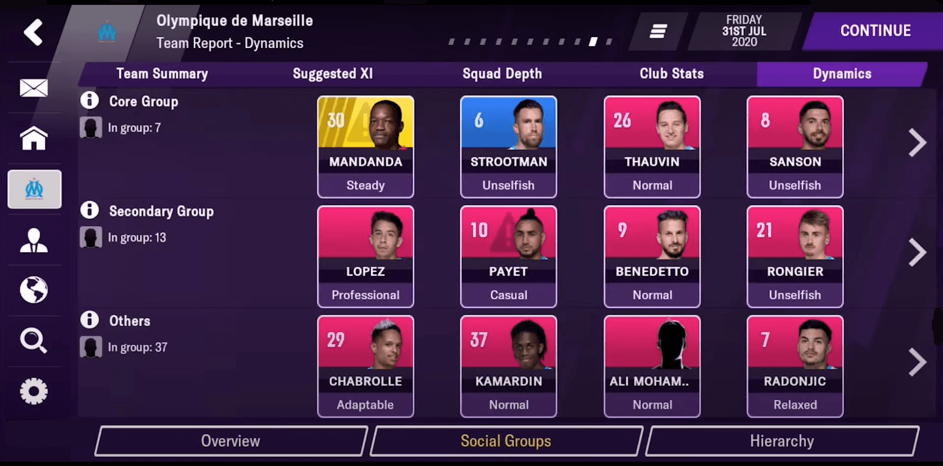
The PC version contains an equivalent page and the mobile page communicates similar information. The page is intended to indicate which social group a player fits within. Explanatory text gives context to the group.
The groups to be shown:
Core
Players are part of the main group within the club. These might not all be influential (or even have similar personalities) but they have solid ties into each other for various reasons which will be visible on their Personal Dynamics page.
Secondary
Players who aren't part of the core socials group but who have clicked with at least some people within the club.
Others
Players who don’t fit into a social group, don't speak the same language as others there or who have just joined the club or aren’t gelling with others at the moment.
Replicate hierarchy screen
The 'Hierarchy' layout was working well and so could be utilised here. Again space would be an issue unless a group row was removed.
1st iteration
Final in game screen
C / 'Player squad relationships' section
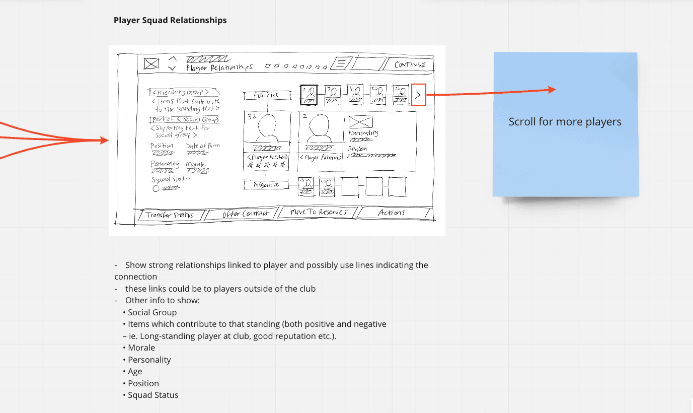
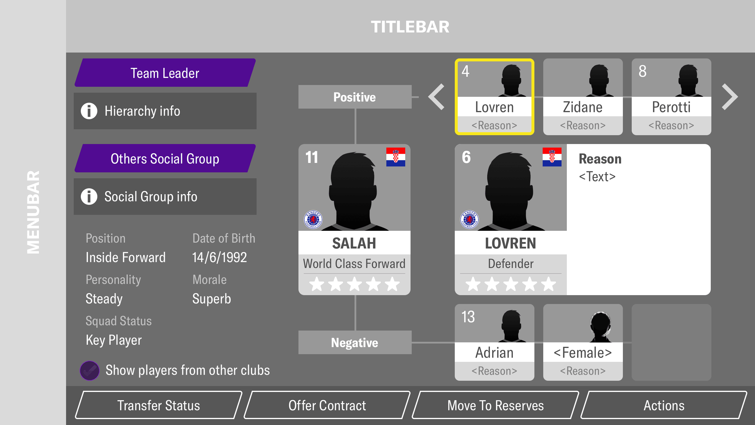
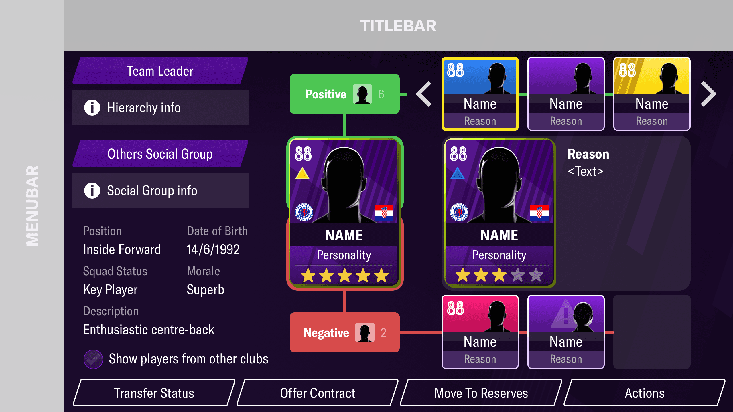
This was a new screen with no equivalent in the PC game. A new section of the player profile detailed the squad relationships that a player had. The screen showed where an association exists between a player and another, this could be positive or negative.
Other information represented on this page needed to include:
Social Group
Items which contribute to that standing (both positive and negative – ie. Long-standing player at club, good reputation etc.).
Morale
Personality
Age
Position
Squad Status
Early sketches
1st iteration
The concept to pursue
Medium fidelity wifeframe
High fidelity wifeframe
Final in game screen

Update all assets to reflect new game branding for 2021 iteration
As well as many other game assets a new iteration of the larger player card was required for 2021 release.
The branding for the year incorporated multiple diagonal strips throughout all game versions. I decided to include this style of graphic subtly into the card backgrounds to link the version.
FM 2021 game branding
There were x2 versions of the player cards required, a star player, represented by a gold background and a standard player with a purple background. I continued with the introduction of a notion of a light source from above, as I had implemented into other assets.
Player card concepts

Final cards

Refresh and rationalise all game icons, refresh on-pitch game assets
Game icons
Refreshed all navigation icons in menus. I felt they were too detailed for the resolution they were scaled for and weren't in line with the format of icons used in other areas of the game. I endeavoured to make a consistent set and bring unity to the game.
Old icons
New icons
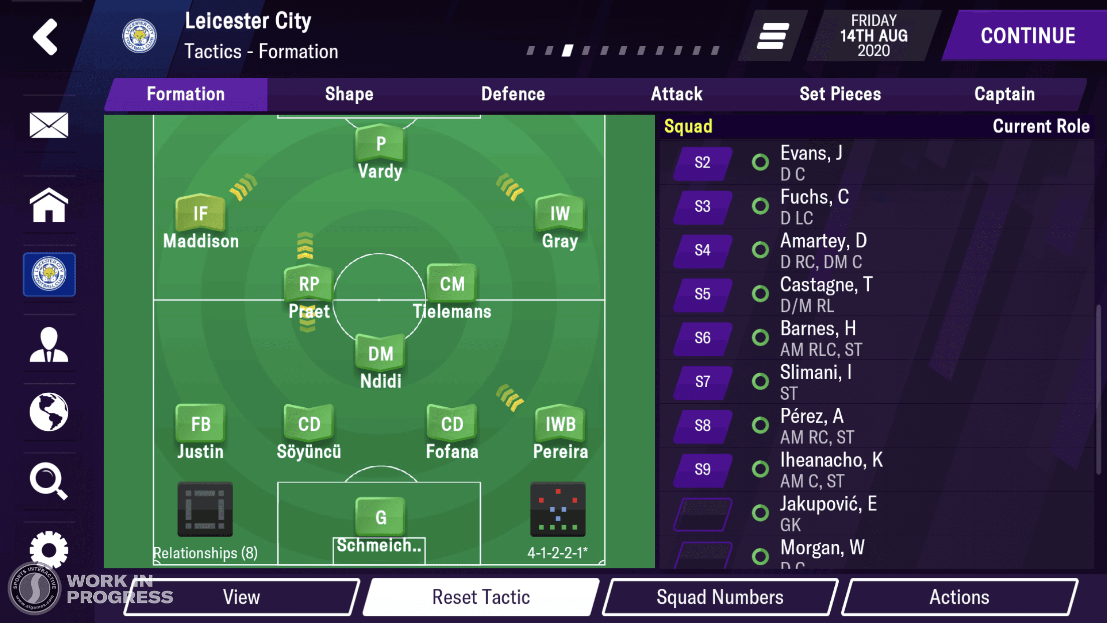
New Pitch and player position indicators
New pitch with a gradient circular cut grass simulation, added the consistent light source feel. (who would have thought grass was tricky to get looking correct)
Consistency in colour across active touch points
Simplifying and unifying the touch points
Introducing a notion of a light source to the player pitch shapes
Introducing a shadow to lift player shapes off the pitch
Larger team formation graphic element
New interactive graphic element toggle for on pitch player chemistry
Old FMM 2020
New FMM 2021
New attack assets
Old FMM 2020
New FMM 2021
Outcome
Result
The 2021 version of the mobile game has broken the previous sales record of over 1,000,000+ sales.
Reflection
To be able to work on such an iconic project who’s sole purpose is to bring joy and entertain, has been overwhelmingly enjoyable.
The mobile team embraced a new way of working that I proposed to speed up the process of delivery.


