Company
ACCA
My role
UX UI Designer
Year
2021 - 2023
Overview
ACCA - Association of Chartered Certified Accountants, provides education and training for its 780,000+ worldwide members and globally has over 110 offices and centres in 51 countries.
New B2B & B2C portal experiences for the world's leading body for professional accountants. Consolidating many legacy systems into one, intuitive, efficient and reliable platform.
Problem statement
ACCA face the challenge and direct need to shift to digital and update many legacy systems for a consolidated experience. The systems are slow, inefficient, and costly and have had little to no design resulting in unsatisfied customers with a 43% customer satisfaction.

Process
Research & discovery
Stakeholders Interviews
I conducted interviews with key stakeholders to understand business objectives and project requirements.
Secondary research
I leveraged secondary research to gather valuable insights and support discussions. By examining existing literature and data, I strengthened the foundation of my work, providing a well-rounded perspective on the topic at hand.
Key findings
User experience
The current user journeys are not clearly defined and are dispersed. The customer is taken to multiple places to complete their journey.
Technology & IT services
Outdated technology is causing many issues such as security and issues with support and is costly to maintain.
Front end design
Inconsistent use of components. Incoherent designs integrating with different 3rd party applications.
Applications
Currently there are many legacy applications which are difficult and costly to maintain.
Solution
Steps to clearly articulate a better user experience through
improved portal architecture
design patterns
providing strategic leadership
content strategy
design briefs
user testing.
Timeline of tasks
gather user tasks and core journeys
identify current pain points and areas for improvement
create a user centric site structure
craft user journeys
design screens
usability testing.
Deliverables
The project was across more than 2 years which allowed us to create multiple journeys across B2B and B2C that elevated the digital transformation strategy for ACCA.
Key features and journeys
Design system - UI components
A focus was on consistency, elevating the user experience, and creating reusable designs. I contributed to a library of UI components and worked closely with the development team when building the library to guarantee technical feasibility.
There needed to be synergy between B2B and B2C portals as they would both be using the same design system, this was still in its infancy but would be evolving as the project progressed.
Small selection of the components

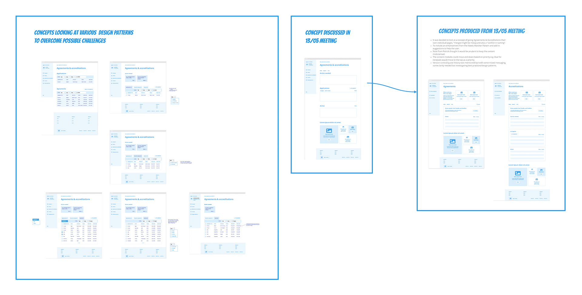
Bulk registration
This application allows the partners to upload multiple applicants and will allow them to have full control of each individual's data. (Below is a small selection of the screens)
Early wireframe concepts produced in Miro
Building out flows in Miro with high fi screens

Selection of high fi screens from the flow

Groups
ACCA partners manage multiple students and applicants, this can be difficult to manage and keep track of where each contact sits and their progress. To create the structure we created the ability to create groups and broke down the key information the user needed to see for each contact and group. (Below is a small selection of the screens)
Building out flows in Miro with high fi screens
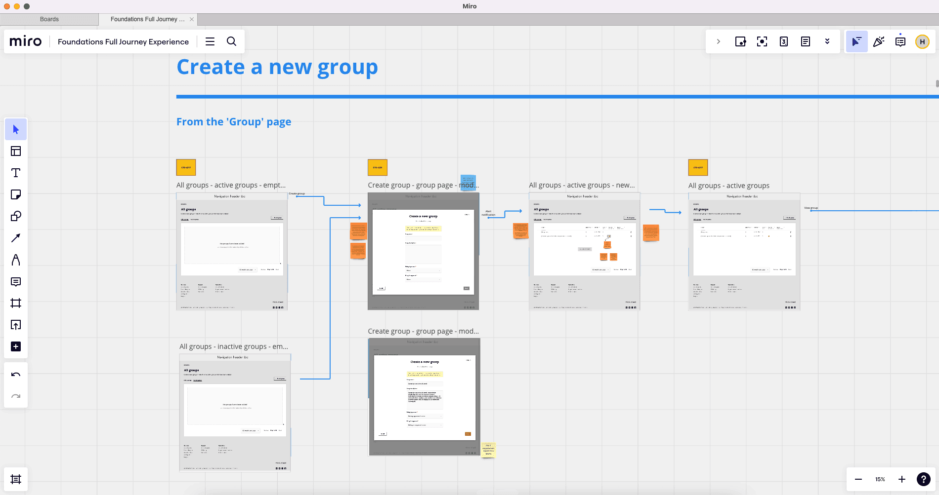
Building out flows in Miro with high fi screens

Selection of high fi screens from the flow

ODCBE - On-demand computer-based exams
The exams are conducted at centres which are licensed by ACCA. The approval and registering process was a massive pain point the client needed to fix. The application created allows the ability to register centres and provide relevant details for submission. This method allows users to easily update their information, and check on their status and provides a seamless ability to renew when needed. (Below is a small selection of the screens)
Selection of high fi screens

High fi screens from flow in Miro
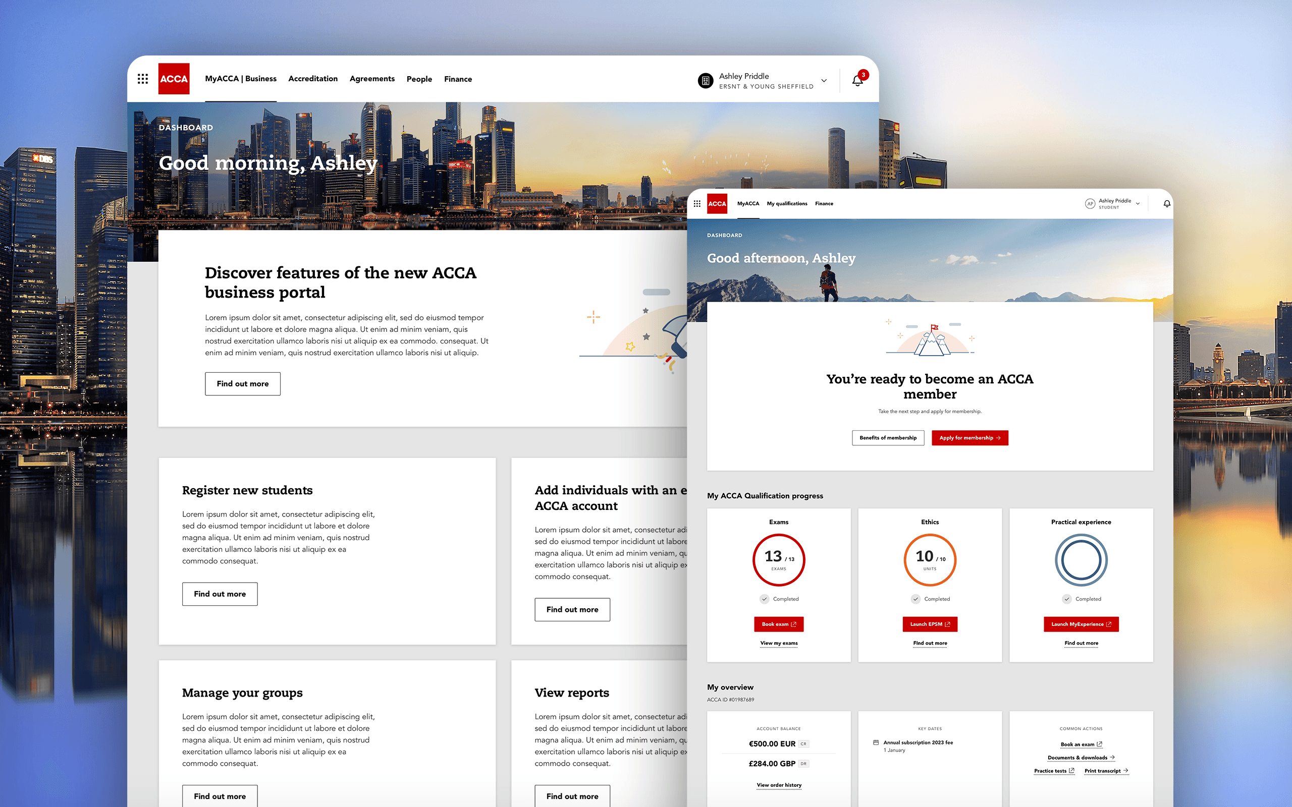
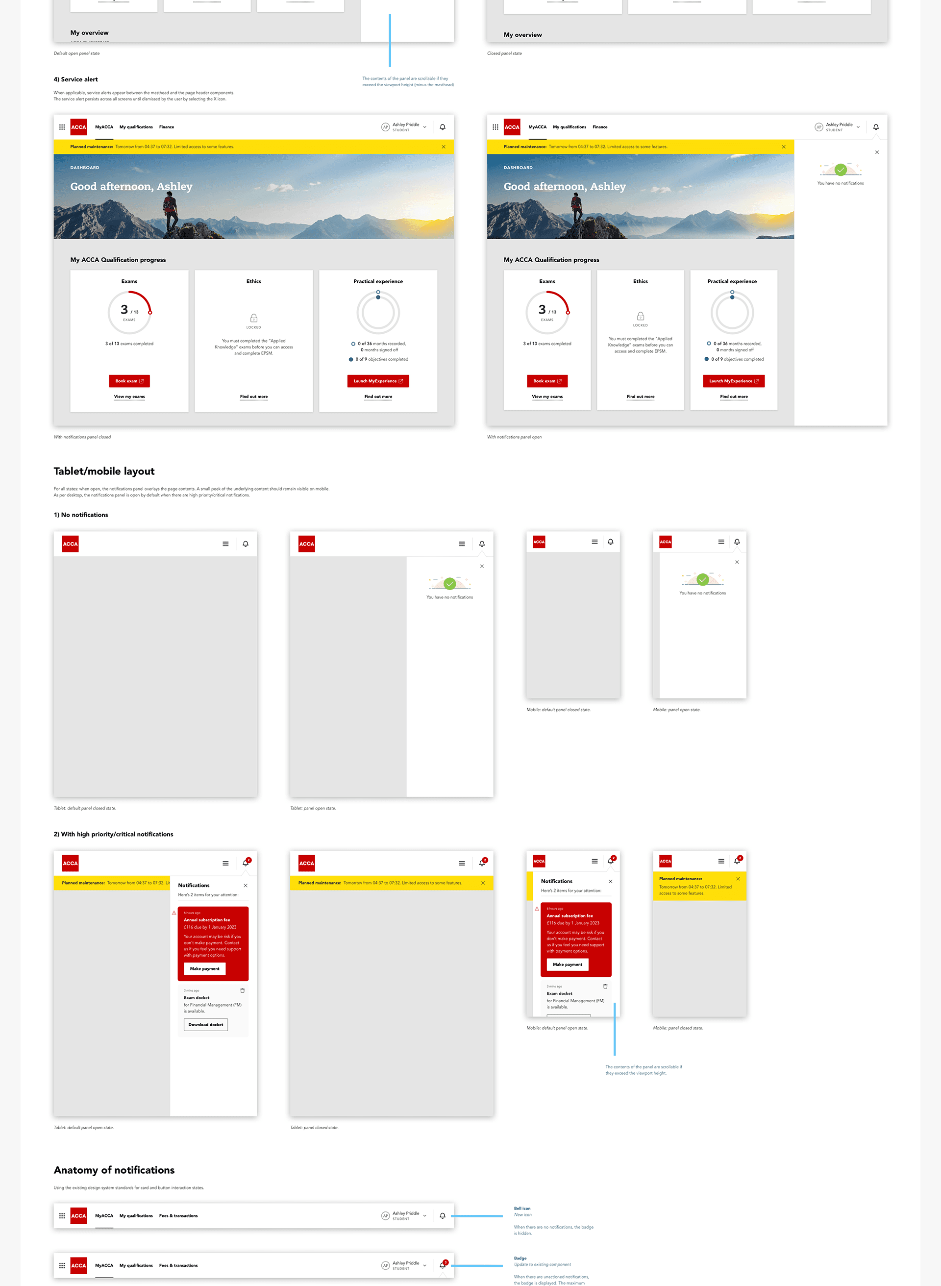
Dashboard & notifications
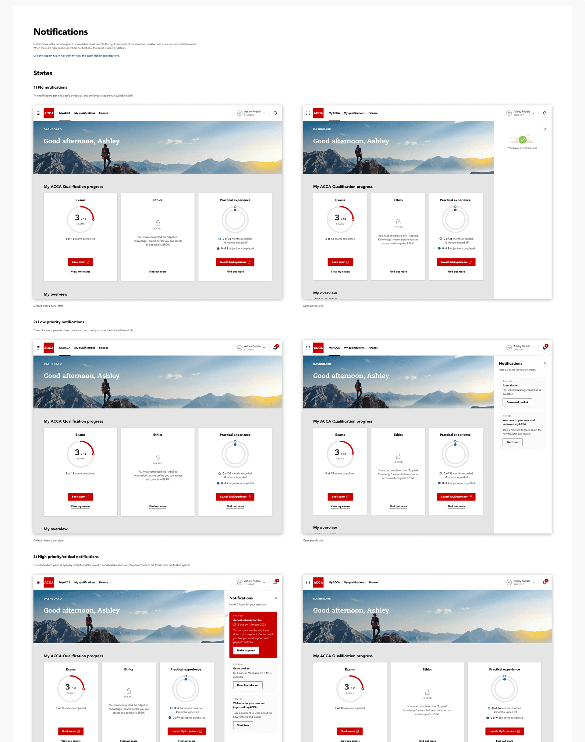
Refreshing the common masthead pattern across the B2C and B2B customer portals and the ACCA Global.com website with small variances based on context. Notifications were added to let users know they have an action to take or important information to read.
Specification for notifications

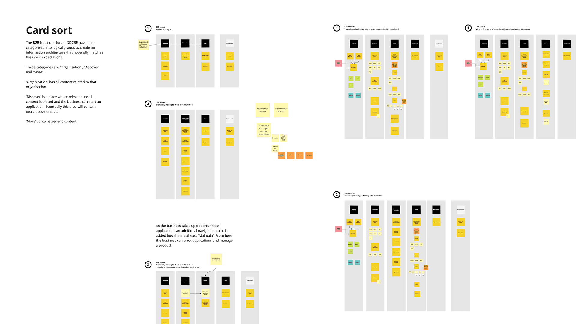
Mapping of the IA

Card sort of the IA
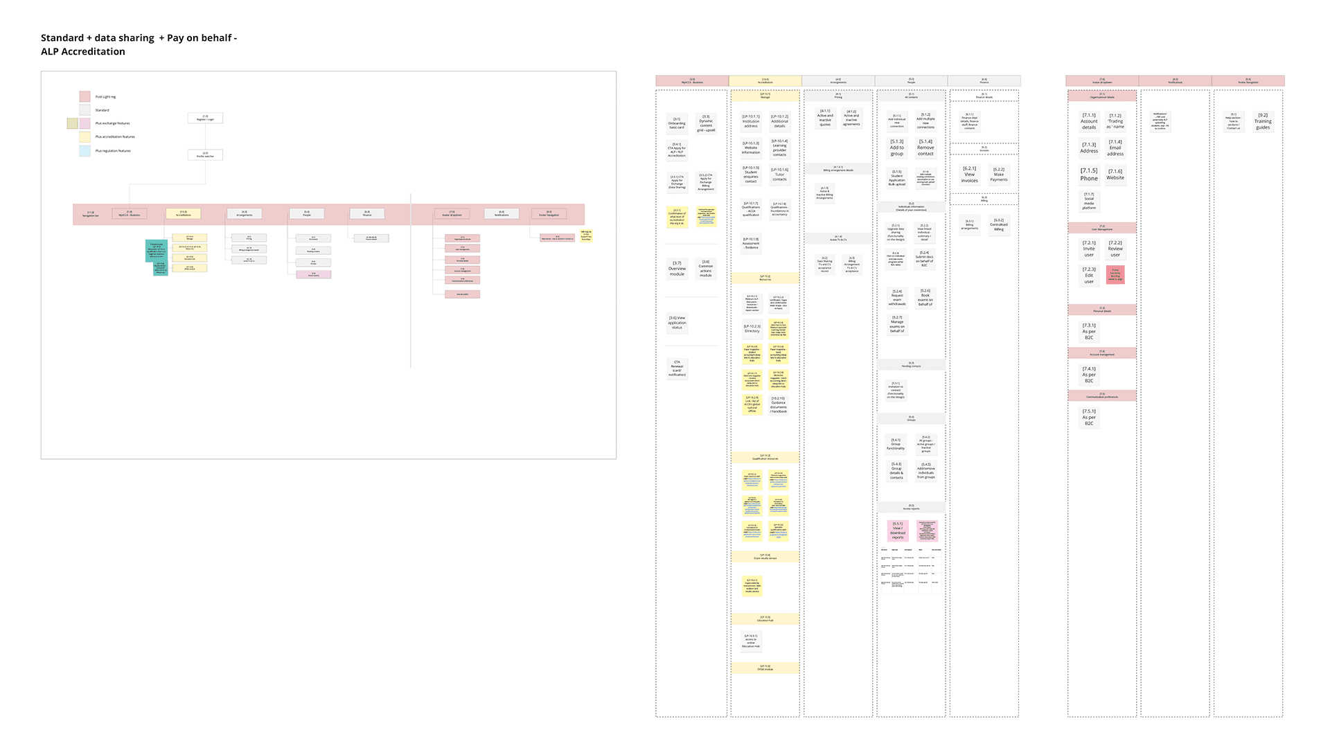
IA on the left and content strategy on the right
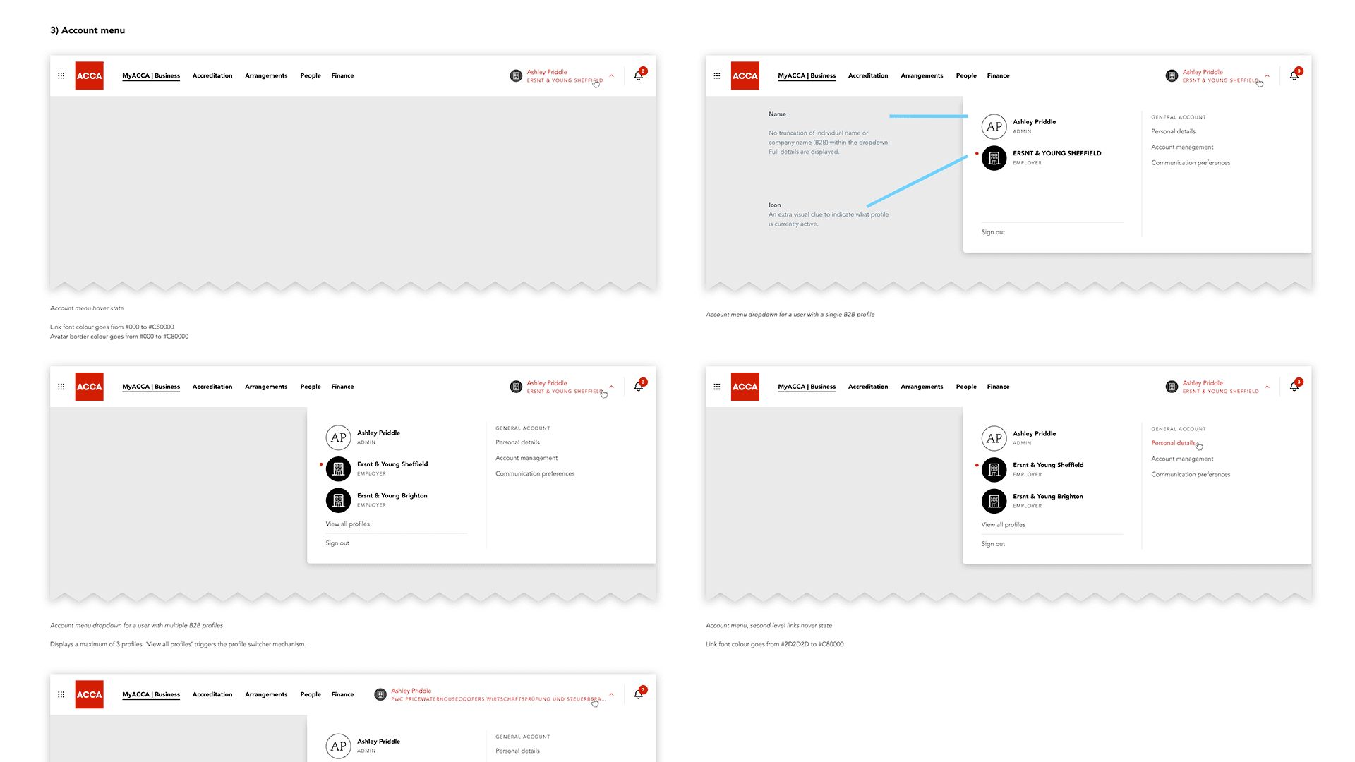
Specification of the B2B navigation

Outcome
Result
More connected experience as there was consistent navigation between the portal and .com
Streamlined design library to increase the reusability of front-end components
User-centric site structure was achieved and complex processes made simple
Cost savings - by centralising finance applications onto a single platform, the organisation’s costs have been reduced by £470,000 per year, while also improving customer service
All analogue communications were successfully shifted to digital methods.
Reflection
Project lacked strong ownership within ACCA and a sound strategy for delivery from the IT solution provider, these factors have hindered the projects progress. The project was paused in Spring 2023 to source a replacement IT service provider. Subsequently I didn’t see the project launch.
Ways of working and the delivery model were changed many times meaning I had to be adaptable and resilient.
Enjoyable and also challenging working on such a large project with a steep learning curve around a difficult subject matter.
Great to be part of a large design team with the ability to sense check thoughts and ideas with them. I've learnt to trust my team-mates and that daily stand-up meetings were key to our success.